主要矛盾很早就开始了,我想给文字本身的颜色实现类似于 backdrop-filter 的毛玻璃效果,但这个效果在文字上并不能直接使用。(可恶)
后续也问了蛮多认识的佬,大多都是改变透明度、混色方式等等去实现貌似是这样的效果,但都不是我想要的。
最终想起了 stackoverflow ,还提了一个问题 (虽然最后被指出是问题重复,有人已经提过了,但是根本搜不到好不好 QwQ)
这边先贴个链接:
也先贴上解决方案:(在 stackoverflow 的基础上进行了改进)
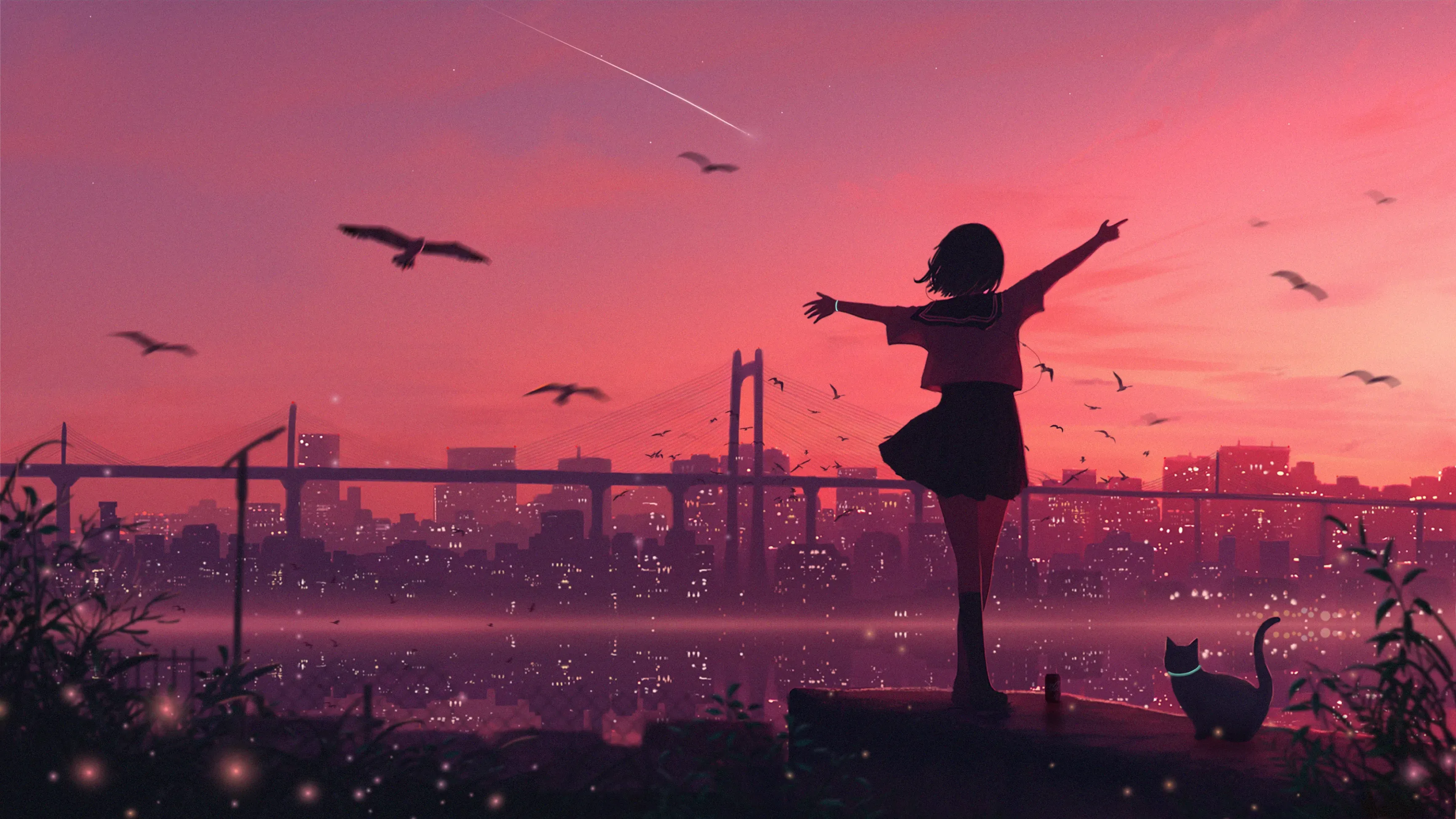
<img src="https://picsum.photos/id/99/500/300">
<img class="clipped" src="https://picsum.photos/id/99/500/300">

<svg height="0" width="0">
    <defs>
        <clipPath id="svgTextPath">
            <text x="50" y="200" textLength="400px" font-family="Vollkorn" font-size="200px" font-weight="700"> Text </text>
        </clipPath>
    </defs>
</svg>body {
margin 10px;
}
.clipped {
position: absolute;
top: 10px;
left: 10px;
clip-path: url(#svgTextPath);
filter: blur(10px) brightness(1.2); // 调节模糊和亮度
}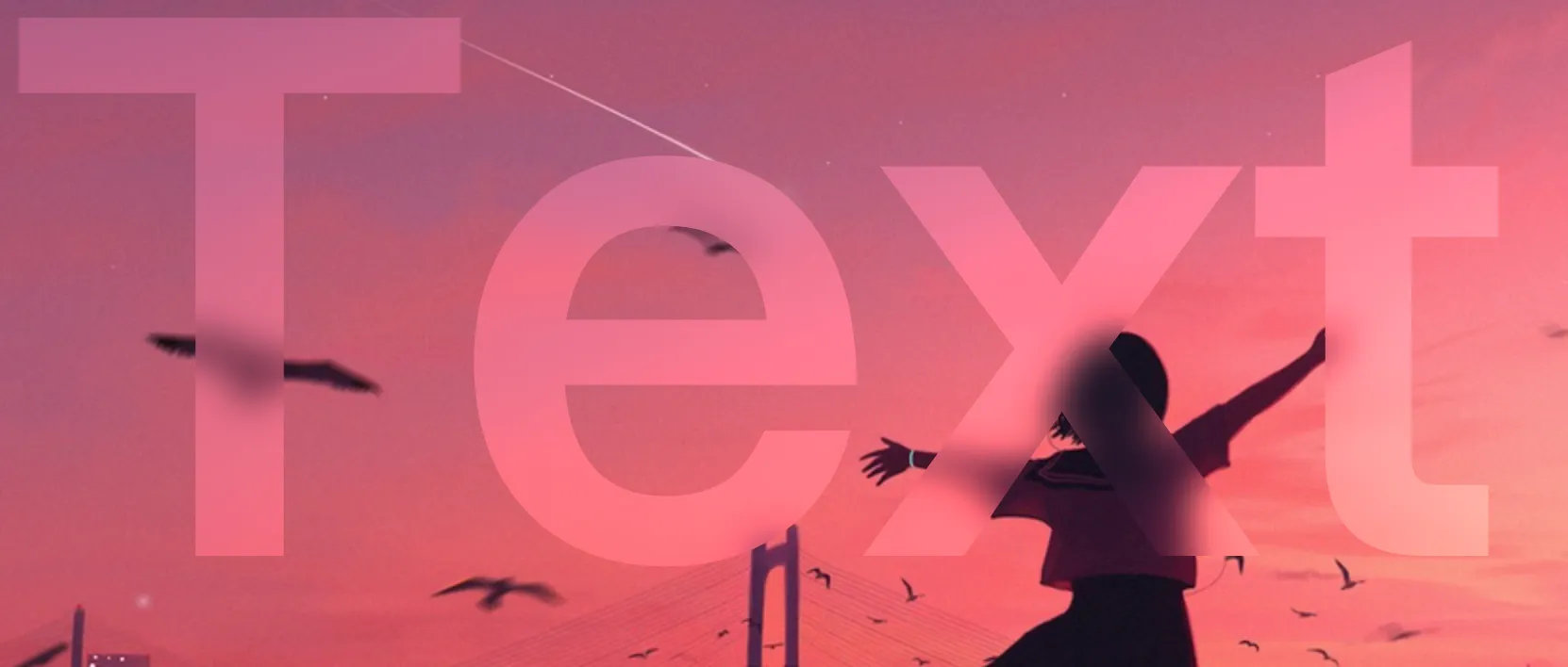
是不是,超级无敌好的效果!
本帖就先这样放着,后续我可能会继续完善这个效果。